Case study — fixing a logged-out WordPress header without guessing in production
Junto Consulting Group's header looked fine to logged-in editors and broken to everyone else. Here is how a preview-first fix restored the menu without a Friday deploy gamble.
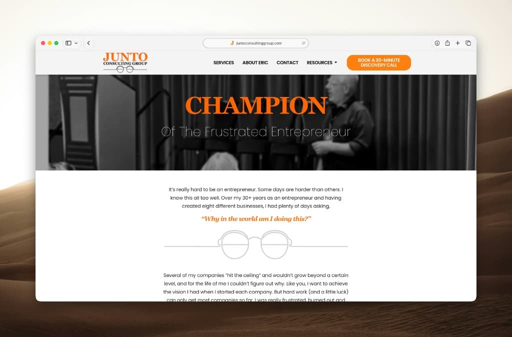
Junto Consulting Group had a classic WordPress failure mode: the site looked fine to people who were logged into wp-admin, and broken to everyone else.
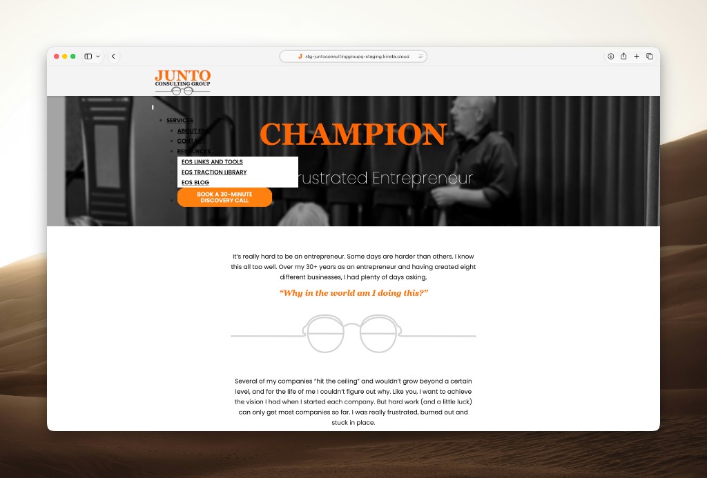
On the public homepage, the header collapsed into a vertical bulleted list over the hero. "SERVICES," "ABOUT ERIC," "CONTACT," and "RESOURCES" stacked on top of the photography instead of sitting in a clean horizontal nav with the discovery-call CTA.
That is not a design preference. That is a trust problem. Prospects see a broken first impression. The agency gets a ticket that says "the menu is messed up" with no useful stack trace.
What was actually broken
The child theme depended on parent Twenty Twenty styles that logged-out visitors were not reliably receiving. BlogVault/Airlift-style optimization does not always honor CSS @import, so the flex layout that holds the desktop nav never loaded for anonymous users.
Logged-in editors still saw the correct header because their asset path differed. That mismatch is why these bugs survive so long: the people who would notice them are often not looking at the logged-out page.
Why production was the wrong place to experiment
Header CSS sits on every page. Guessing in production means:
- Every visitor sees the experiment
- Cache layers can show mixed results
- A bad rule can take down navigation sitewide
The right move is a reviewed preview on a staging copy of the live site, then publish only after the logged-out view matches the intended layout.
What changed
The fix was not a redesign. It was a delivery correction:
- Stop relying on parent
@importthat optimizers skip - Enqueue the parent Twenty Twenty stylesheet the WordPress way
- Remove the hard-coded stylesheet link that fought the proper queue
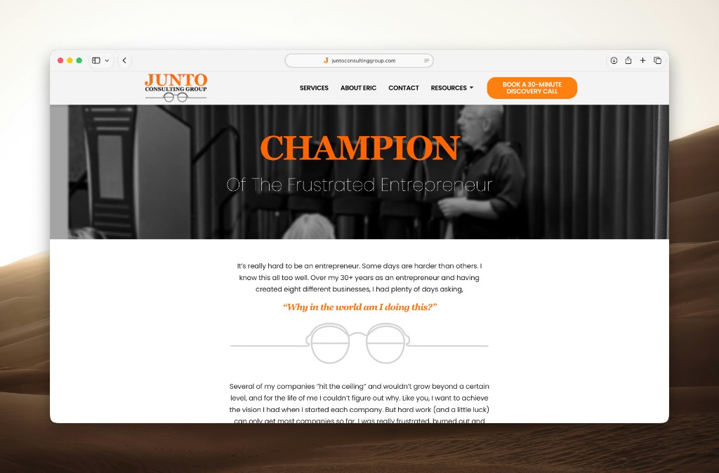
- Verify the logged-out homepage: horizontal nav, intact hero, discovery CTA visible
Before: a bulleted menu covering "CHAMPION / Of The Frustrated Entrepreneur." After: the same brand and photography, with a working header again.
The lesson for agencies
If a bug only appears for logged-out users, your QA process is incomplete. And if your only way to test a header change is editing production CSS until it "looks right," you will keep paying for emergencies that a preview would have caught in ten minutes.
Backbone exists for that loop on existing WordPress sites: describe the outcome, preview safely, approve before publish. Junto's header was a real change request — not a demo mockup.
See the before/after on the homepage, or start a free agency trial if you want the same review workflow on your client sites.
Ready to try the review loop on a real site?
Start a free agency trial, or go back to the blog index.